
Color plays a vital role in home décor. It not only enhances the beauty of your space but also reflects your personal style. Think about your favorite colors. How can you use them to create a space that feels like home?
Consider this: warm colors like reds and yellows can create a vibrant and inviting atmosphere, while cool colors like blues and greens can bring a sense of calm and spaciousness. To truly elevate your home, it’s essential to choose the right color scheme, as it can transform your space into a place that genuinely represents you.
Key Takeaways
Identify your favorite colors to set a personal tone for your home. Your base color should reflect what makes you feel happy and relaxed.
Consider the purpose of each room when choosing colors. Use calming shades for workspaces and warm tones for inviting living areas.
Apply the 60-30-10 rule to balance your color scheme. This structure helps create visual interest and prevents any color from overwhelming the space.
Blend warm and cool tones to achieve a harmonious atmosphere. This balance enhances the mood and functionality of your home.
Test paint colors with swatches in different lighting. This ensures your chosen colors look great at all times of the day.
Choose a Base Color

Identify Your Favorite Color
Choosing a base color is one of the most important steps in creating a home that feels uniquely yours. Start by thinking about your favorite colors. What hues make you feel happy or relaxed? Your favorite color can set the tone for your entire space.
Here are some psychological effects of choosing a favorite color as your base:
Different colors can impact your mood and well-being.
Understanding color psychology helps create spaces that feel more like home.
Strategic color choices can influence a room’s ambiance and mood.
Colors can stimulate emotional responses and affect productivity, energy levels, and self-esteem.
When you select a color that resonates with you, it can transform your space into a personal sanctuary.
Consider the Room’s Purpose
Next, think about the purpose of the room. Each space in your home serves a different function, and the color you choose should reflect that. For example, a study or home office might benefit from calming blues to promote focus and productivity. On the other hand, a living room could use warm tones to create an inviting atmosphere.
Room Function | Recommended Color Scheme | Emotional Response |
|---|---|---|
Study/Home Office | Monochromatic shades of blue | Promotes calmness and productivity |
Small Living Room | Light shades like pastels or neutrals | Creates a sense of spaciousness |
Larger Living Area | Darker hues like dark blues or charcoal grays | Creates an intimate setting |
Lighter colors can make a room feel more open, while darker shades can create a cozy vibe. By understanding the function of each room, you can choose a base color that enhances its purpose.
Neutral colors also offer great flexibility. They can adapt to various styles and staging needs, whether you live in a modern condo or a cozy suburban home. Here are some benefits of using neutral shades:
They appeal to a wider audience, enhancing your home’s financial value.
Homes with neutral décor attract more potential buyers, as they can envision their own style in the space.
Neutral tones can be styled to fit different design approaches, from contemporary to rustic.
By selecting a base color that resonates with you and suits the room’s purpose, you set the foundation for a beautiful and harmonious home.
Explore Complementary Colors

Understanding Color Relationships
When it comes to color, understanding relationships is key. The color wheel is a fantastic tool that helps you visualize how colors interact. It shows primary, secondary, and tertiary colors, making it easier to find complementary colors. Complementary colors sit directly opposite each other on the wheel. For example, blue and orange are complementary. This pairing creates a striking contrast that can make your décor pop.
Here are some examples of complementary color pairs:
Blue and orange
Red and green
Yellow and purple
Using these combinations can add vibrancy to your space. Imagine an orange rug against turquoise walls. This contrast not only catches the eye but also creates a lively atmosphere.
Using the 60-30-10 Rule
Now that you know about complementary colors, let’s talk about how to use them effectively. The 60-30-10 rule is a great guideline for balancing colors in your home. This rule divides your color scheme into three parts:
60% – Dominant color
30% – Secondary color
10% – Accent color
By following this structure, you create a visual hierarchy that guides the viewer’s focus. It helps prevent any single color from overwhelming the space. For instance, if your dominant color is a soft blue, you might choose a deeper blue as your secondary color and add vibrant orange accents. This balance enhances visual interest and harmony in the room.
Here’s how the 60-30-10 rule works:
The dominant color covers most of the room, setting the overall mood.
The secondary color adds depth and contrast.
The accent color provides a pop that draws attention.
Remember, it’s essential to consider natural light when applying this rule. Colors can look different under various lighting conditions, so test them out before committing.
By exploring complementary colors and applying the 60-30-10 rule, you can create a stunning and cohesive look in your home. This approach not only enhances your space but also reflects your personal style beautifully.
Balance Warm and Cool Tones
Defining Warm and Cool Colors
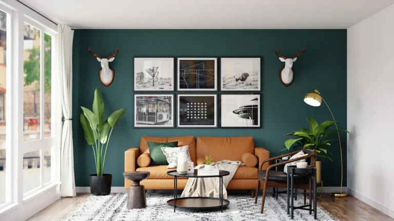
Understanding warm and cool colors can significantly impact your home’s atmosphere. Warm colors, like red, yellow, and orange, evoke feelings of warmth and comfort. They stimulate emotions and promote activity, making them perfect for lively spaces. On the other hand, cool colors such as green, blue, and violet create a calming atmosphere. These colors are associated with tranquility and expansiveness, making them ideal for relaxation areas.
When you choose the right color scheme, consider how these tones affect your mood. For instance, warm colors can make a narrow hallway feel wider, while cool colors can make small rooms appear more spacious. Warm tones create intimacy by making walls seem closer, while cool tones give the illusion of depth, enhancing the sense of spaciousness.
Creating a Cohesive Look
To achieve a balanced atmosphere, blend warm and cool tones thoughtfully. Here are some tips to help you create a cohesive look:
Include both warm and cool elements in your color palette while ensuring consistency in undertones.
Blend styles intentionally to create contrast without losing cohesion.
Anchor mixed styles with unified architectural elements to establish a strong base.
Use contrast to guide focus by creating differences between focal points and backgrounds.
Test colors in real-world conditions to see how they appear in different lighting.
Maintaining consistency in undertones across different spaces helps unify the overall look. You can use neutral colors as a backbone for stability and flexibility in your color schemes. Remember the 60-30-10 rule: 60% of a room should feature the dominant color, 30% should highlight secondary shades, and 10% should pop with accents.
By balancing warm and cool tones, you can create a home that feels inviting and harmonious. This approach not only enhances your space but also reflects your personal style beautifully.
Introduce Accent Colors
Selecting Effective Accent Colors
Accent colors play a crucial role in your home décor. They add interest and impact to your color scheme. Typically, these colors are bold and vivid, used sparingly to draw attention to specific areas. This approach adds dimension and defines spaces within your home.
When choosing accent colors, consider these tips:
Use a color wheel to identify complementary colors.
Ensure there’s enough contrast between your accent and base colors.
Follow accessibility guidelines to meet contrast ratio requirements.
Some popular accent colors in contemporary home décor include:
Peach
The trio of white, black, and blue
Tropical colors like yellow, green, pink, and orange
Yellow and blue
Fiery red
These colors can create a striking contrast that enhances visual interest and prevents monotony in your design.
Tips for Incorporating Accents
Incorporating accent colors into your home can be fun and creative. Here are some effective methods to do so:
Method | Description |
|---|---|
Statement Furniture Pieces | Choose furniture items that feature your selected accent color, like a deep blue sofa or olive green armchair. |
Textiles and Fabrics | Add throw pillows, blankets, and curtains in trending colors to create a dynamic decor. |
Incorporate Artwork | Display abstract wall art that includes your accent colors for aesthetic enhancement. |
Accessorize Wisely | Use decorative home accents like vases and sculptures in your chosen shades for a subtle shift in feel. |
Consider Wall Colors | Paint an accent wall in a trending color for an impactful refresh. |
By using these methods, you can reinforce the style of your room while maintaining unity in design. Remember, the strategic use of accent colors not only boosts the aesthetic appeal but also contributes to the overall atmosphere of your space. So, go ahead and experiment with different combinations to find what works best for you!
Additional Tips for Color Selection
Testing Colors with Swatches
Before you commit to a color, testing is crucial. You want to see how your chosen shades look in different lighting. Colors can change dramatically based on the light in your home. Here are some tips for testing colors effectively:
Use swatches: Get paint samples and apply them to your walls. This way, you can see how they look at different times of the day.
Move samples around: Take your sample boards to various rooms. Observe how the colors appear under different lighting conditions throughout the day.
Watch for metamerism: This phenomenon can cause colors to look different in various lights. Always check your swatches in the actual space where you plan to use them.
By following these steps, you’ll ensure that the colors you choose look just as you envisioned.
Maintaining Cohesion Across Spaces
Creating a cohesive look throughout your home can be a challenge, especially in open-concept designs. Here are some strategies to help you maintain a unified color scheme:
Strategy | Description |
|---|---|
Use a consistent color palette | Select accessories in your chosen color palette to keep a cohesive look from room to room. |
Consistent flooring or textures | Use similar rugs or curtains in each room to create continuity, even with varying color palettes. |
Consistent lighting | Ensure the color temperature of lighting is uniform across rooms to maintain true colors. |
Strategic artwork | Choose artwork that shares a common color or theme to visually connect rooms. |
Utilize transition spaces | Paint hallways or doorways in a shade that bridges adjacent rooms. |
Repetition of accent colors | Incorporate one or two accent colors from your main palette in various elements across rooms for visual flow. |
By following these strategies, you can create a harmonious atmosphere throughout your home. Remember, the goal is to choose the right color scheme that reflects your style while ensuring each space feels connected.
Choosing the right color scheme can truly transform your home into a reflection of your personal style. Start by identifying your favorite colors and consider the purpose of each room. Remember to explore complementary colors and balance warm and cool tones.
Here are some key steps to keep in mind:
Identify the undertones of colors for harmony.
Consider the temperature of colors to set the right mood.
Incorporate neutrals for balance.
Ensure contrast to make elements stand out.
Add unexpected hues for visual interest.
Don’t hesitate to experiment with different combinations. The right colors can enhance your well-being and create a space that feels just right for you!